Image Optimization: Complete Developer Guide

Images are one of the biggest factors affecting website speed and user experience. If you’re uploading images without optimizing them, you’re likely slowing down your site, wasting bandwidth, and frustrating users. Here’s the good news: optimizing images can fix these issues.
Key Takeaways:
- Choose the right formats: JPEG for photos, PNG for transparency, WebP or AVIF for smaller file sizes, and SVG for scalable graphics.
- Compress smartly: Use lossy compression for smaller files or lossless compression when quality is critical.
- Resize images: Avoid oversized files by creating multiple sizes for different devices.
-
Use responsive HTML: The
<picture>andsrcsetelements let browsers load the best image for each user. - Leverage CDNs: Deliver images faster with global caching and on-the-fly transformations.
- Automate workflows: Tools like Sharp, ImageMagick, and Simple File Upload streamline resizing, compression, and delivery.
- Ensure accessibility: Add descriptive alt text and follow accessibility standards like WCAG 2.1.
By combining these techniques, you can improve page load times, reduce data usage, and create a better experience for users across all devices. Let’s dive into the details.
image optimization for the web
Image Formats and Compression Methods
Selecting the right image format and compression approach can significantly reduce file sizes without sacrificing visual quality. Each format serves specific functions, so knowing their features can help you make the best choice for your project.
Common Image Formats
WebP is now the default choice for most web images. It delivers excellent compression with minimal quality loss, supports transparency and animation, and is universally supported across browsers. In nearly all cases, replacing JPEG or PNG with WebP reduces file size by 25–35%.
AVIF is the next-generation format offering even smaller file sizes and superior quality at low bitrates. It’s ideal for high-resolution imagery and performance-critical sites. Encoding is slower, and Safari support can still be inconsistent, so provide WebP or JPEG fallbacks when needed.
JPEG remains acceptable for photos when you need maximum compatibility or very fast encoding. It handles complex color gradients well but produces larger files compared to WebP or AVIF.
PNG should be reserved for assets requiring pixel-perfect accuracy or lossless transparency, such as logos, UI icons, and screenshots. It’s heavier than newer formats but still valuable when precision matters.
SVG is best for vector graphics — logos, icons, and simple illustrations. Because SVGs are resolution-independent and compact, they scale infinitely without blurring and help reduce load times for graphical interfaces.
Lossy vs. Lossless Compression
Lossy compression reduces file sizes by removing less noticeable data. JPEG employs this method to create smaller files, though repeated editing can degrade image quality over time.
Lossless compression, on the other hand, retains all the original data while using efficient encoding to reduce file sizes. PNG is a prime example of this, often chosen when preserving exact image quality is essential, even if it results in larger files.
Modern tools and libraries provide precise control over these trade-offs. For example:
- Sharp (Node.js) offers efficient image processing and low memory usage, making it great for batch jobs.
- ImageMagick provides a powerful command-line suite for advanced image manipulation, including color space conversion and custom filtering.
- TinyPNG specializes in smart compression for PNG images, reducing file sizes while maintaining visual quality for web optimization.
Modern Formats and Browser Support
Browser compatibility plays a key role in using modern image formats effectively. Formats like WebP have broad support in current browsers, allowing developers to take advantage of their benefits while providing fallbacks for older browsers.
AVIF is gaining traction, but not all browsers fully support it yet. To address this, the HTML <picture> element can be used to serve multiple formats:
<picture>
  <source srcset="image.avif" type="image/avif">
  <source srcset="image.webp" type="image/webp">
  <img src="image.jpg" alt="Description" loading="lazy">
</picture>
This setup ensures AVIF is delivered to compatible browsers, WebP serves as a backup, and JPEG acts as a universal fallback. Using this method improves page load times, reduces bandwidth usage, and enhances the overall user experience. Choosing the right combination of formats and compression methods is essential for efficient image optimization in modern web development.
Image Resizing and Delivery
Getting images to load quickly while maintaining their quality is all about resizing them correctly and delivering the right size for each situation.
Image Resizing for Performance
Oversized images can be a real drag - literally. If you upload a 2,000px-wide image but display it in a 300px-wide container, browsers still download the full file. That extra weight slows down your page and wastes bandwidth. The fix? Generate multiple image sizes that align with how they'll actually appear on your site.
Take advantage of tools like Sharp for batch resizing:
const sharp = require('sharp');

// Generate multiple sizes from a single source image
const sizes = [300, 600, 1200];
sizes.forEach(width => {
  sharp('source-image.jpg')
    .resize(width)
    .jpeg({ quality: 80 })
    .toFile(`image-${width}w.jpg`);
});
For most web images, a JPEG quality setting of 75–85 strikes a good balance between file size and visual quality. Adjust it based on your specific needs.
Make sure to create sizes that cater to both mobile and desktop users. Mobile devices need smaller images, while desktops can handle larger ones. This groundwork is essential for delivering responsive images.
Responsive Images with HTML
Using the srcset attribute in your HTML helps browsers pick the best image size based on the user's device and connection, saving bandwidth for mobile users while ensuring high-resolution screens display crisp images.
<img src="image-800w.jpg"
     srcset="image-400w.jpg 400w,
             image-800w.jpg 800w,
             image-1200w.jpg 1200w"
     sizes="(max-width: 600px) 400px,
            (max-width: 1000px) 800px,
            1200px"
     alt="Product showcase">
The sizes attribute tells browsers how much space the image will occupy at various screen widths. This way, browsers can choose the most suitable image from the srcset before downloading it, rather than relying solely on viewport size.
Sometimes, you may need to show different crops or compositions depending on the screen size. That's where the <picture> element comes in handy. It allows you to serve entirely different images for different contexts:
<picture>
  <source media="(max-width: 600px)" srcset="mobile-crop.jpg">
  <source media="(max-width: 1200px)" srcset="tablet-crop.jpg">
  <img src="desktop-crop.jpg" alt="Hero banner">
</picture>
This approach ensures your images look great and fit the context, no matter the device.
CDN Delivery for Global Performance
After resizing and setting up responsive images, the next step is to deliver them efficiently. This is where a Content Delivery Network (CDN) comes into play. CDNs store cached versions of your images on servers worldwide, reducing the physical distance between users and your content. The result? Faster load times for users, no matter where they are.
For example, Simple File Upload’s CDN optimizes image delivery by serving files from the nearest edge location. It also supports on-the-fly transformations, letting you request specific image sizes and formats directly through the URL:
<!-- Original image -->
<img src="https://cdn.simplefileupload.com/image.jpg">

<!-- Resized and optimized version -->
<img src="https://cdn.simplefileupload.com/image.jpg?w=400&q=80&f=webp">
Cache headers are another critical factor in CDN performance. These headers allow images to stay cached at edge locations for a set amount of time, reducing repeated downloads for returning visitors. While most CDNs handle this automatically, you can fine-tune the settings based on how often your images are updated.
Developer Workflow Integration
Automating image processing can simplify workflows and help maintain cleaner, more efficient code.
Automated Image Processing Tools
When it comes to automating image tasks, several tools stand out for their simplicity and effectiveness:
Sharp is a go-to library for Node.js applications. It handles tasks like resizing and format conversion efficiently and can be integrated directly into your build pipeline or used as middleware for real-time processing:
const sharp = require('sharp');
const fs = require('fs');

// Pipeline integration
async function processImages() {
  const inputDir = './src/images';
  const outputDir = './dist/images';

  const files = fs.readdirSync(inputDir);

  for (const file of files) {
    await sharp(`${inputDir}/${file}`)
      .resize(1200, null, { withoutEnlargement: true })
      .jpeg({ quality: 85, progressive: true })
      .toFile(`${outputDir}/${file}`);
  }
}
ImageMagick is another powerful option, especially for server-side batch processing. Its command-line interface makes it easy to integrate into shell scripts or CI/CD pipelines for advanced image manipulation:
# Batch process all images in a directory
for img in *.jpg; do
  convert "$img" -resize 800x600^ -gravity center -crop 800x600+0+0 "optimized_$img"
done
For Python developers, Pillow provides a straightforward API for resizing and optimizing images, making it a great fit for Django or Flask projects:
from PIL import Image
import os

def optimize_image(input_path, output_path, max_width=1200, quality=85):
    with Image.open(input_path) as img:
        if img.width > max_width:
            ratio = max_width / img.width
            new_height = int(img.height * ratio)
            img = img.resize((max_width, new_height), Image.Resampling.LANCZOS)

        img.save(output_path, optimize=True, quality=quality)
By leveraging these tools, developers can automate image workflows and ensure seamless integration with platforms like Simple File Upload.
Simple File Upload Integration
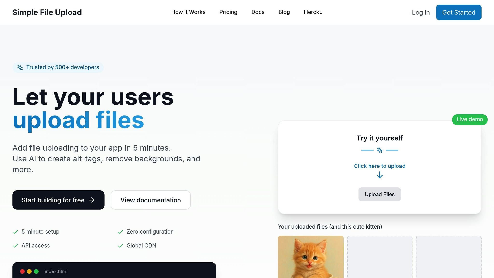
Simple File Upload takes care of image optimization, allowing you to focus on your application's core functionality. It supports direct uploads, bypassing your server and sending files directly to its infrastructure for processing.
Here's an example of integrating Simple File Upload with a React component:
// React integration example
import { SimpleFileUpload } from 'simple-file-upload-react';

function ImageUploader() {
  const [uploadedFiles, setUploadedFiles] = useState([])

  const handleFileChange = (event) => {
    console.log('Event:', event)

    // Access files from event.allFiles
    if (event.allFiles) {
      const files = event.allFiles.map(file => ({
        id: file.id,
        name: file.name,
        url: file.cdnUrl,
        size: file.size
      }))
      setUploadedFiles(files)
    }
  }

  return (
    <SimpleFileUpload
      publicKey="YOUR_PUBLIC_KEY"
      onChange={handleFileChange}
    />
  )
}
The platform also offers an AI-powered feature for generating descriptive alt text for images, which is especially useful for content-heavy sites.
File Upload Optimization Best Practices
Optimizing file uploads goes beyond automation. Adopting best practices ensures efficient and resilient performance.
Start with client-side validation to reduce unnecessary server requests. Check file type, size, and dimensions before uploading:
function validateImage(file) {
  const allowedTypes = ['image/jpeg', 'image/png', 'image/webp'];
  if (!allowedTypes.includes(file.type)) {
    throw new Error('Invalid file type');
  }

  if (file.size > 5 * 1024 * 1024) { // 5MB limit
    throw new Error('File too large');
  }

  return true;
}
Implement progress indicators to keep users informed during uploads. Here's an example using XMLHttpRequest:
// Upload with progress tracking
const uploadFile = (file, onProgress) => {
  return new Promise((resolve, reject) => {
    const xhr = new XMLHttpRequest();
    xhr.open('POST', '/upload', true);

    xhr.upload.onprogress = function(event) {
      if (event.lengthComputable) {
        const progress = (event.loaded / event.total) * 100;
        onProgress(progress);
      }
    };

    xhr.onload = function() {
      if (xhr.status === 200) {
        resolve(JSON.parse(xhr.responseText));
      } else {
        reject(new Error('Upload failed'));
      }
    };

    xhr.onerror = function() {
      reject(new Error('Network error'));
    };

    const formData = new FormData();
    formData.append('file', file);
    xhr.send(formData);
  });
};
Make sure to handle issues like network errors, file corruption, or server failures gracefully:
async function handleUpload(file) {
  try {
    validateImage(file);
    const result = await uploadFile(file, (progress) => {
      console.log(`Upload progress: ${progress}%`);
    });
    return result;
  } catch (error) {
    if (error.message === 'Network error') {
      // Retry logic
      return retryUpload(file, 3);
    } else {
      showError('Upload failed. Please try again.');
    }
  }
}
For batch uploads, process multiple files in parallel while limiting the number of concurrent uploads to avoid overloading the server:
async function uploadMultiple(files) {
  const BATCH_SIZE = 3;
  const results = [];

  for (let i = 0; i < files.length; i += BATCH_SIZE) {
    const batch = files.slice(i, i + BATCH_SIZE);
    const batchResults = await Promise.all(
      batch.map(file => uploadFile(file, (progress) => {
        console.log(`Uploading ${file.name}: ${progress.toFixed(2)}%`);
      }))
    );
    results.push(...batchResults);
  }

  return results;
}
Finally, webhook notifications can simplify tracking upload completion and trigger tasks like updating databases or sending alerts after successful uploads. These practices ensure a smoother, more efficient user experience.
Accessibility and Compliance
Ensuring your website is accessible isn’t just a nice-to-have - it’s essential for inclusivity and a smart move to protect your business from legal risks. Accessibility makes your content usable for people with disabilities, while compliance with established guidelines safeguards your organization.
Alt Text and Image Metadata
Alt text is the cornerstone of image accessibility. It allows screen readers to describe visual content for users with visual impairments. To make alt text effective, keep it concise and descriptive. For example, instead of "Image of handbag", use something like "Red leather handbag with gold hardware, $89.99." For purely decorative images, an empty alt attribute (alt="") ensures screen readers skip over them.
<!-- Informative image -->
<img src="chart.jpg" alt="Sales increased 40% from January to March 2024">

<!-- Decorative image -->
<img src="border-decoration.png" alt="" role="presentation">

<!-- Functional image (like buttons) -->
<img src="search-icon.png" alt="Search">
File names and metadata also play a role in accessibility and SEO. Avoid generic file names like "IMG_1234.jpg." Instead, use descriptive ones such as "blue-running-shoes-nike-air-max.jpg." Metadata like title tags and captions provide additional context. For example:
<figure>
  <img src="team-meeting.jpg"
       alt="Five developers collaborating around a whiteboard with code diagrams"
       title="Weekly sprint planning session">
  <figcaption>Our development team planning the next sprint cycle</figcaption>
</figure>
For complex visuals, ARIA labels can provide detailed descriptions:
<img src="complex-chart.jpg"
     alt="Quarterly revenue breakdown by region"
     aria-describedby="chart-description">
<div id="chart-description">
  North America generated $2.3M (45%), Europe $1.8M (35%),
  and Asia-Pacific $1.0M (20%) in Q3 2024.
</div>
If you’re managing a large image library, automation tools can simplify the process.
AI-Powered Alt Text Generation
Manually creating alt text for thousands of images is time-consuming. This is where AI-powered tools step in, automatically generating descriptive alt text and saving hours of effort. For example, Simple File Upload offers an AI feature that analyzes images and creates context-appropriate descriptions:
// Enable AI alt-text generation during upload
<simple-file-upload
  public-key="YourPublicKey"
  alt-text
></simple-file-upload>
// AI generates alt text automatically
// Result: { url: '...', altText: 'Person wearing blue jeans and white sneakers walking on concrete sidewalk' }
ADA Compliance Requirements
Compliance with accessibility laws like the ADA and guidelines such as WCAG 2.1 Level AA is critical. While the ADA doesn’t explicitly address websites, courts often interpret its principles to include digital content. WCAG provides a clear framework for ensuring your images meet accessibility standards.
Key requirements include:
- Every meaningful image must have alt text.
- Decorative images should use empty alt attributes.
- Complex images need detailed descriptions.
- Text within images must meet color contrast standards (4.5:1 for normal text, 3:1 for large text).
/* Example of sufficient text contrast for overlays */
.image-overlay {
  background-color: rgba(0, 0, 0, 0.7); /* Dark overlay */
  color: #ffffff; /* White text */
  /* This combination provides a 15:1 contrast ratio */
}
For images like charts, provide text alternatives, such as data tables:
<!-- Data table alternative for a chart -->
<img src="sales-chart.jpg" alt="Monthly sales data for 2024" aria-describedby="sales-table">

<table id="sales-table" class="sr-only">
  <caption>Monthly Sales Data 2024</caption>
  <thead>
    <tr><th>Month</th><th>Sales ($)</th><th>Growth (%)</th></tr>
  </thead>
  <tbody>
    <tr><td>January</td><td>$45,000</td><td>+12%</td></tr>
    <tr><td>February</td><td>$52,000</td><td>+15%</td></tr>
    <!-- Additional rows -->
  </tbody>
</table>
Optimize images for performance to accommodate users with slower internet speeds. Use techniques like progressive image loading to deliver smaller, faster-loading images first, with high-resolution versions available for those who need them:
<!-- Progressive image loading -->
<picture>
  <source media="(min-width: 800px)" srcset="high-res.webp" type="image/webp">
  <source media="(min-width: 800px)" srcset="high-res.jpg" type="image/jpeg">
  <source srcset="mobile-optimized.webp" type="image/webp">
  <img src="mobile-optimized.jpg"
       alt="Product demonstration showing key features"
       loading="lazy">
</picture>
Accessibility audits are crucial for maintaining compliance. Automated tools like axe-core or WAVE can identify issues, but manual testing with screen readers ensures a more accurate user experience. Keep thorough records of your efforts to demonstrate your commitment to accessibility if challenges arise.
Conclusion
Optimizing images is a cornerstone of effective web development today. As we've discussed, managing images the right way can significantly boost your application's speed, improve user experience, enhance accessibility, and even cut down on bandwidth and storage costs.
Here’s a quick recap of the essentials: pick the right image formats, adopt modern ones like WebP or AVIF whenever possible, deliver images responsively, and rely on automated workflows to maintain consistency.
To make this process smoother, tools like Simple File Upload can be a game-changer. By automating tasks like format conversion, resizing, and generating alt text, it removes the headache of building and maintaining complex infrastructure.
Accessibility has also become a must-have, not a nice-to-have. Combining clear alt text, accurate metadata, and optimized performance ensures an inclusive experience for all users while safeguarding against potential legal challenges.
The benefits of optimizing images extend beyond accessibility and performance. Faster loading pages delight users, search engines favor well-optimized sites, and reduced bandwidth usage lowers infrastructure costs. Whether you’re managing a handful of images or millions, the approach stays the same: start optimizing early, automate as much as you can, and balance performance with accessibility. These strategies lay a solid foundation for any modern web project.
FAQs
How can I make my images accessible for users with visual impairments?
To ensure your images are accessible to users with visual impairments, always include descriptive alt text. This text should clearly explain the image's content and purpose, focusing on the most important details. Aim to keep it concise - ideally around 125 characters.
It's also important to check that your images have adequate color contrast. If needed, you can use ARIA roles to provide extra context for screen readers. These practices make your content more inclusive, particularly for those using assistive technologies.
What are the best practices for selecting the right image format for your website?
Choosing the right image format is all about finding the sweet spot between image quality and website performance. JPEG is a go-to for high-quality photographs because it compresses efficiently without a noticeable loss in detail. If you’re working with images that need transparency - like logos or icons - PNG is a better fit.
For modern web needs, WebP and AVIF stand out. These formats offer impressive compression, keeping file sizes small while retaining excellent image quality, which can significantly improve how quickly your pages load. And if you’re dealing with vector graphics, SVG is the way to go. It allows you to scale images up or down without any loss of clarity.
Picking the right format not only keeps your site looking sharp but also ensures it performs smoothly for users.
What’s the best way to automate image optimization in my development workflow?
To make image optimization easier and more efficient, you can use tools like TinyPNG, ImageMagick, or Sharp as part of your development workflow. These tools handle tasks such as resizing, compressing, and converting image formats automatically, delivering consistent results without requiring manual input.
By integrating these tools into your build process or CI/CD pipeline, you can simplify repetitive tasks and save valuable time. Automation scripts can take care of routine optimizations, and some tools even adjust images dynamically based on the target platform or device. This not only speeds up workflows but also enhances the user experience with faster loading times and well-optimized visuals.
Related Blog Posts
Ready to simplify uploads?
Join thousands of developers who trust Simple File Upload for seamless integration.